challenge
The communication team needed a way to engage their employees to interact with the posted content not only by commenting, but also by rating and sharing more often. In addition, the solution had to be easily adaptable to the company’s future content platforms.
results
As a result, the development team delivered their commenting plugin that sparked more engagement than the previous ones. A solution tailored to the needs which we discovered during the user research. What is more, the user research allowed the team to redefine the goal – and, in the end, cut the scope of work and development time. ABB employees can now use effective, fast ways of reacting to ABB content posted on the intranet.
process and work
In-depth user experience research to learn users habits. Crafting personas to bring users close to the development team. Fast, interactive prototyping to verify designed solutions and interaction metaphors.

research
I analysed the last five years of users’ behaviour and responses towards the posted content. Doing benchmark, running interviews and creating personas made us realise that our main goal isn’t simply to make people comment more often. Instead, the real challenge was to let them interact in an easier way, like giving “likes” and “dislikes”. Hence, our goal changed from achieving a bigger number of comments, to a bigger number of interactions in general.

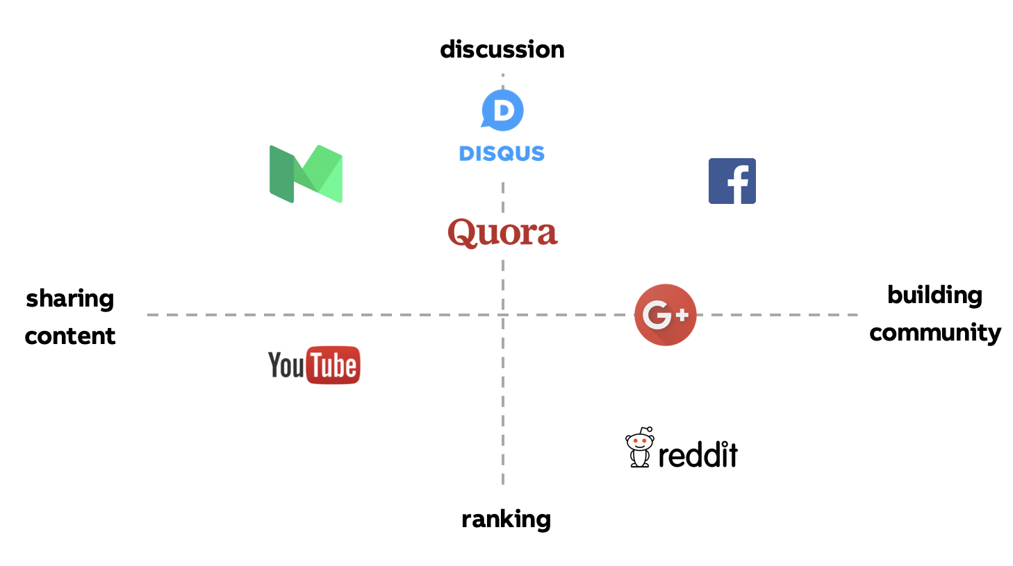
Part of the analyse for a benchmark.
ideation / prototyping
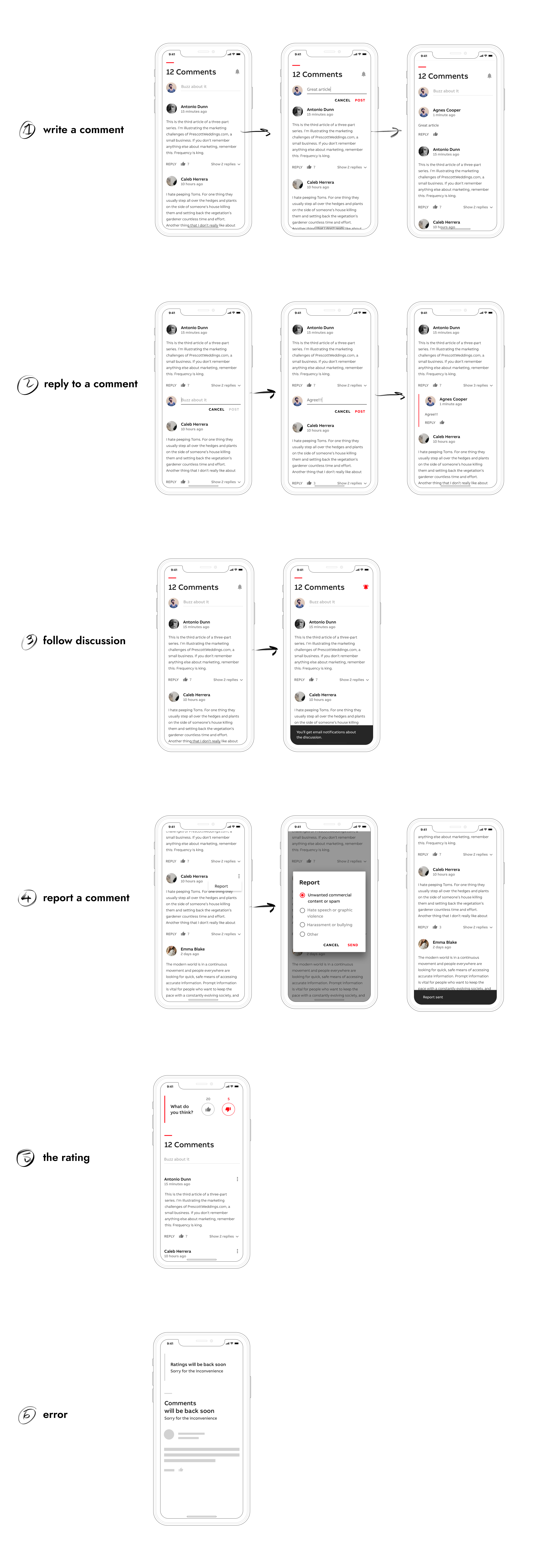
I’ve started the ideation phase by creating many rapid paper prototypes / low-fidelity wireframes. This way I could start with a broad vision and come up with many variations. Then I moved my ideas to the Sketch and created many artboards. Designing UI for the plugin was an iterative process that included many consultations with the development team and other designers.

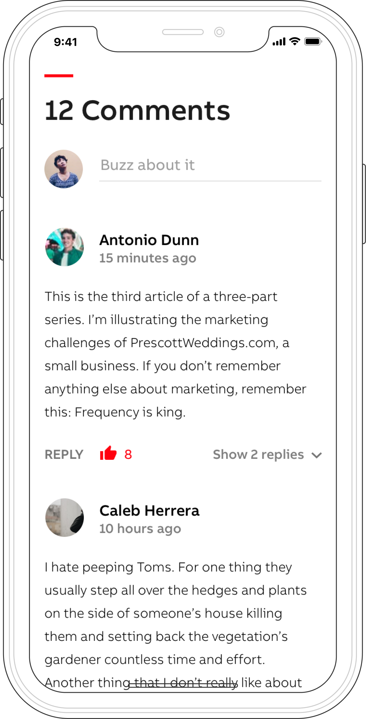
*Images presented here are not the actual designs.
validation
The prototype of the new solution was tested locally using a corridor testing method. I tested e.g. the buttons’ placement, font sizes and ratings. It made it possible to pick up UI bugs and instantly adjust the prototype.
