challenge
Working time of all employees needs to be recorded and assigned to appropriate projects. The previously implemented solution had a really bad fame because of its poor usability and a process full of repetitive tasks. We faced the challenge of simplifying the process and designing a new app that wouldn’t be another employees’ nightmare. We aimed to design an app that would allow the controlling team to efficiently manage the whole process and minimize the input for the regular employees.
results
As a result, we created a solution that suits users’ needs and is a great help in communication with a future vendor.
process and work
In-depth user experience research to learn users’ habits. Crafting personas to bring users close to the development team. Fast, interactive prototyping to verify designed solutions and interaction metaphors.

research
We started the research by planning the interviews. We created the interview scenario focusing on the work/time recording process but also including profiling questions and questions regarding daily routine at work.
In one week we interviewed 15 people from the following groups: regular employees, managers and controlling team members. Surprisingly, people complained about the process, not the app.
We realised that to get the whole picture, we needed to really understand the process. That’s why we used the service blueprint technique to create a visualisation of the process.
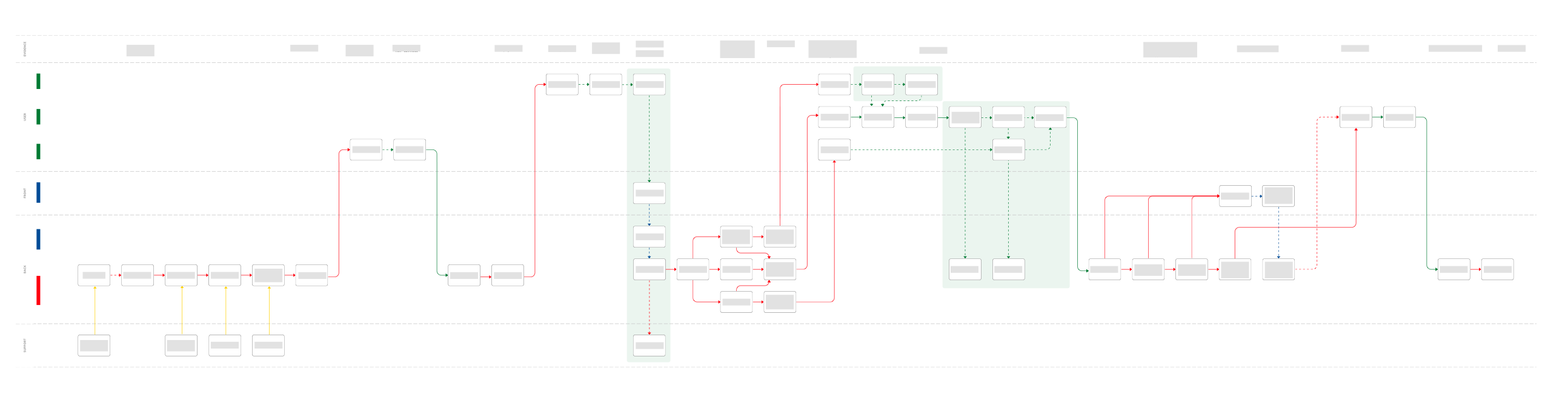
Service Blueprint of the process.(It was rather complex.)
ideation / prototyping
Moving on to the ideation phase we started by individually creating paper prototypes. Our goal was to come up with as many tangible ideas as possible and present them to the design team. Paper prototypes allowed us to exchange ideas, combine them and in the end come up with the best solution.
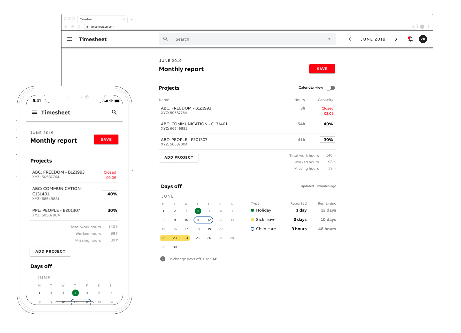
From pen and paper, we moved to Figma and created the prototype. We kept down to a minimum the monthly input of the employees, so that those with a steady schedule do not need to take any action until their schedule changes. Managers gained more control over their employees’ reports thanks to the possibility of bulk actions. For the controlling team, we created several report views, previously only available as excel files, and an extended dashboard that allows e.g. sending reminders to pending reports. In addition, we created sample emails for both employees and managers.
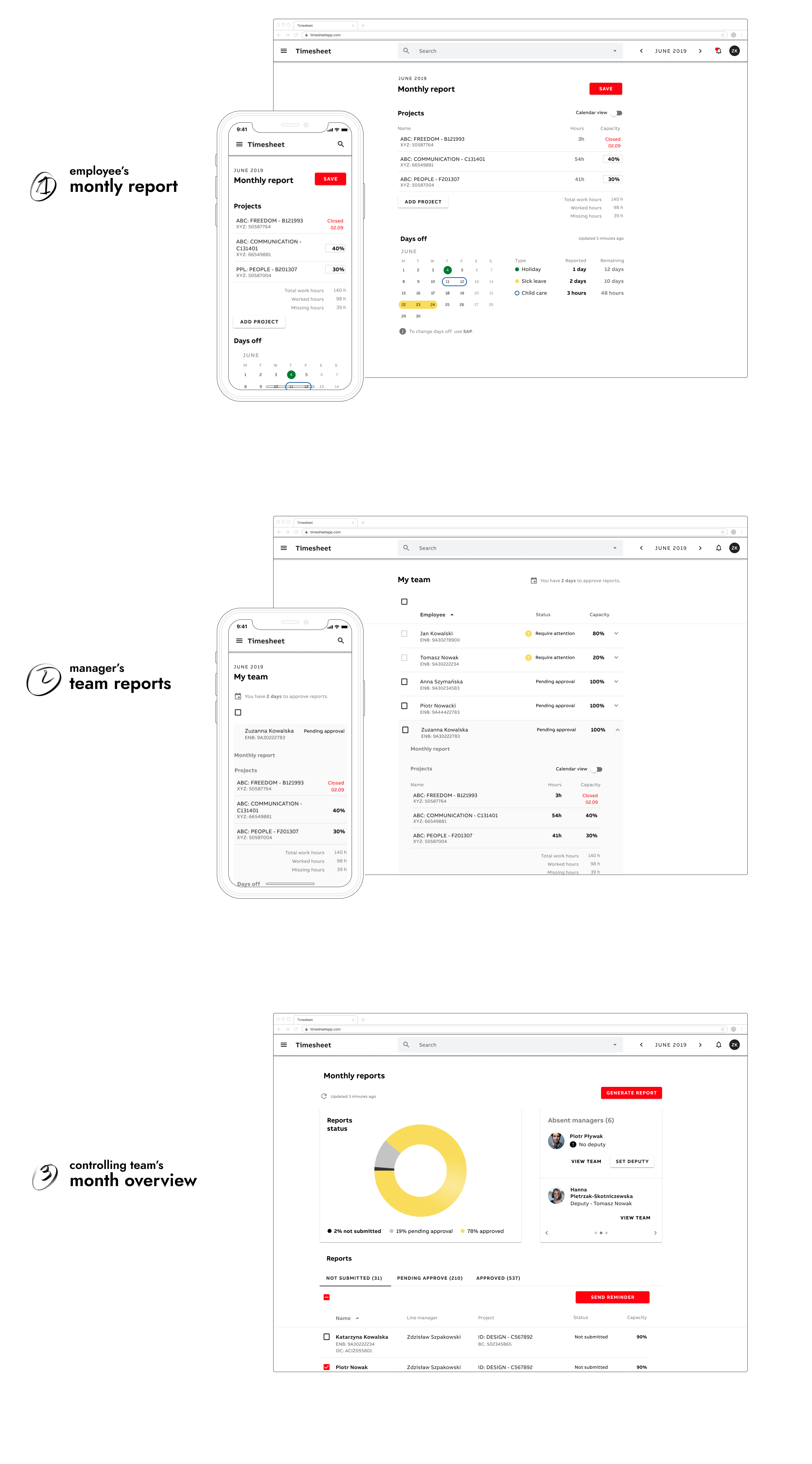
*Images presented here are not the actual designs.
validation
All prototypes were tested with the users. For one week we conducted user tests with 11 users from each group. It allowed us to extract the pain points of the design and adjust them in the next iteration.